 "ttyymmnn" (ttyymmnn)
09/02/2015 at 22:00 • Filed to: None
 0
0
 14
14|
"ttyymmnn" (ttyymmnn)
09/02/2015 at 22:00 • Filed to: None | 0
| 14 |
Take a peek at
!!!error: Indecipherable SUB-paragraph formatting!!!
to see a potential future look of Gawker. They’re playing with fonts again.
 Arch Duke Maxyenko, Shit Talk Extraordinaire
> ttyymmnn
Arch Duke Maxyenko, Shit Talk Extraordinaire
> ttyymmnn
09/02/2015 at 22:07 |
|
Could be worse.
 bobkustofawitshz
> ttyymmnn
bobkustofawitshz
> ttyymmnn
09/02/2015 at 22:16 |
|
Wow, that sucks. It hurts my eyes to look at it.
I hope that never happens here.
 Birddog
> ttyymmnn
Birddog
> ttyymmnn
09/02/2015 at 22:20 |
|
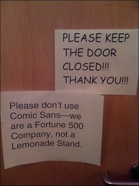
Git yer Guns! It’s Comic Sans fer all!
 DasWauto
> ttyymmnn
DasWauto
> ttyymmnn
09/02/2015 at 22:23 |
|
I’m just happy we’re not the guinea pigs this time. Also, why is the font so gigantic? To the best of my knowledge I haven’t suddenly turned 94 years old.
 scoob
> ttyymmnn
scoob
> ttyymmnn
09/02/2015 at 22:29 |
|
 jester74
> ttyymmnn
jester74
> ttyymmnn
09/02/2015 at 22:31 |
|
It sucks. The font's huge and there is way too much whitespace.
 facw
> DasWauto
facw
> DasWauto
09/02/2015 at 22:37 |
|
Jalopnik has been testing this over the past week as well, though I haven’t seen Oppo use it yet. And yeah. way too big, they clearly want something that looks like a fancy magazine on small tablet screens.
|
facw
> ttyymmnn
09/02/2015 at 22:38 |
|
Not just fonts, the pictures are larger as well (which looks good, unlike the giant font).
|
DasWauto
> facw
09/02/2015 at 22:41 |
|
I noticed flickers of it on my phone last week but it hasn’t happened in a couple of days and I hope it stays that way.
 Funktheduck
> ttyymmnn
Funktheduck
> ttyymmnn
09/02/2015 at 23:00 |
|
Am I the only one that doesn't mind?
|
ttyymmnn
> facw
09/02/2015 at 23:04 |
|
And this is the thing that’s driving be crazy across the whole Internet. Web design is not dictated by the tablet and the phone, and desktop sites look like shit. For a prime example of how bad it can be, just look at the Washington Post. I must say, the idea of having one site design that changes based on the size of the screen is quite smart, and Gawker has done a better job than most on implementing it. But that new font (Palatino?) looks terrible. I had reduce zoom level on my browser to make it look half way decent.
|
ttyymmnn
> DasWauto
09/02/2015 at 23:06 |
|
I had to lower the zoom level on my browser to make it look half way decent. I think Gawker’s design is pretty good, on desktop and phone. They need to leave it alone.
|
facw
> ttyymmnn
09/02/2015 at 23:16 |
|
I actually cancelled my WP sub because their redesign made it so unreadable. I have no idea what they were thinking. I understand wanting to be tablet friendly, but you can’t ignore everyone else. Make a responsive site if you need to handle such different screen sizes.
|
ttyymmnn
> facw
09/03/2015 at 08:48 |
|
They’ve made some cosmetic adjustments in the last couple of days, so it’s a bit better. But still not great.